Elements within the Photo

There are three basic photography techniques that I will review today. These techniques are the rule of thirds, leading lines, and depth of field. In each example I will first examine a professional photo that displays at least one of these photography techniques. Then I will examine a photo that I have taken that mimics the technique that was used in the professional photo.

Rule of Thirds

The rule of thirds is a technique that involve the composition of a photo. Imaginary lines are divide the image into thirds both horizontally and vertically using an imaginary grid. The idea is to place the focal point of your subject along one of the lines of your imaginary grid, preferably along one of the intersections of that grid. This technique will make the composition more interesting.

Fire  hydrant in wilderness
https://prodeoetpatria.wordpress.com/2017/01/05/photography-challenge-week-1-rule-of-thirds/

The first photo that I am examining today comes from the blog by Mr. C called “The Chief End” at https://prodeoetpatria.wordpress.com/2017/01/05/photography-challenge-week-1-rule-of-thirds/. I was drawn to this photo of a fire hydrant because of its interesting colors and beautiful background.

As you can see from the draw over, the hydrant falls exactly along one of the grid lines making it a perfect example of the rule of thirds. This keeps the fire hydrant as the focal point, while showcasing a bit of the background as well, adding to the overall interest of the piece.

red fire hydrant

Next is my version of the rule of thirds using a fire hydrant. This fire hydrant caught my eye because of its bright color contrasting the drab and dreary surrounding winter scenery. This fire hydrant’s red paint shined like a beacon in the midst of the yellow grass, brown branches and gray sidewalks of the cold January landscape.

Taking a look at the grid, this fire hydrant also falls directly on the left-hand line. The trees in the background provide balance on the right side without taking away from the fire hydrant as the focal point of the photo.

Leading Lines

Leading lines are another photography technique used to create great photos. Leading lines draw the viewers eye into the photo and are often used to direct the focus of the view on the main subject in the photo. They can also be used to create depth within your image.

fence leading lines
https://marycubrich.weebly.com/blog/blog-6-leading-linesrepetition-with-varietyrule-of-thirds

This photo of a fence taken by Mary Cubrich at https://marycubrich.weebly.com/blog/blog-6-leading-linesrepetition-with-varietyrule-of-thirds. She captured a beautiful photo of something as simple as a chain link fence leading to a rosebush.

The fence pole as well as the top of the fence provide leading lines diagonally across the page. This leads the eye from the bottom left corner to the top right corner. It draws the viewer deeper into the photo.

chain link fence

My version a fence creating leading lines comes from this photo that I took at the softball park by my house.

The leading lines of the chain link are also on a slight diagonal, but lead more to the middle of the page instead of the corner where they meet the dugout and backstop of the softball field. The lines create depth that is aided with shallow depth of field as well.

Depth of Field

For this post I am examining a shallow depth of field. This technique is achieved when one subject is in sharper focus while the background and surrounding elements are blurry or out of focus. One of the reasons to do this is to isolate a subject from its environment. This is used often when taking portraits. It brings more attention to the subject at the focal point, making the background less distracting.

toy school bus in road
https://enviragallery.com/how-to-get-shallow-depth-of-field-in-your-photos/

I love this photo found at https://enviragallery.com/how-to-get-shallow-depth-of-field-in-your-photos/. It has such fun colors and subject matter. It is also a perfect example of shallow depth of field.

The draw over shows the area of focus in the photo. Even though the focus of the photo is a tiny toy school bus, the shallow depth of field draws the eye directly to the tiny toy. The out of focus background still provides color and balance without being too distracting.

tiny toy jeep

My attempt at shallow depth of field uses my son’s tiny toy jeep. I love this little jeep and the memories that I have of my son playing with it for hours when he was younger.

This was the technique that was most difficult for me to replicate. As you can see, the jeep is in focus, while the background is slightly blurry, but not as out of focus as the professional example. I think this may be due to my camera and also my photography experience. I was happy with the result, but I am looking forward to practicing and perfectly this technique in the future.

Conclusion

I enjoyed examining and practicing the photography techniques including the rule of thirds, leading lines and depth of field. It was interesting to search for photos that exemplified these techniques and it was very educational trying to replicate them in my own work. I look forward to implementing these techniques in my future work as a designer.

Contrast -Just Do It

Nike Shoe Ad
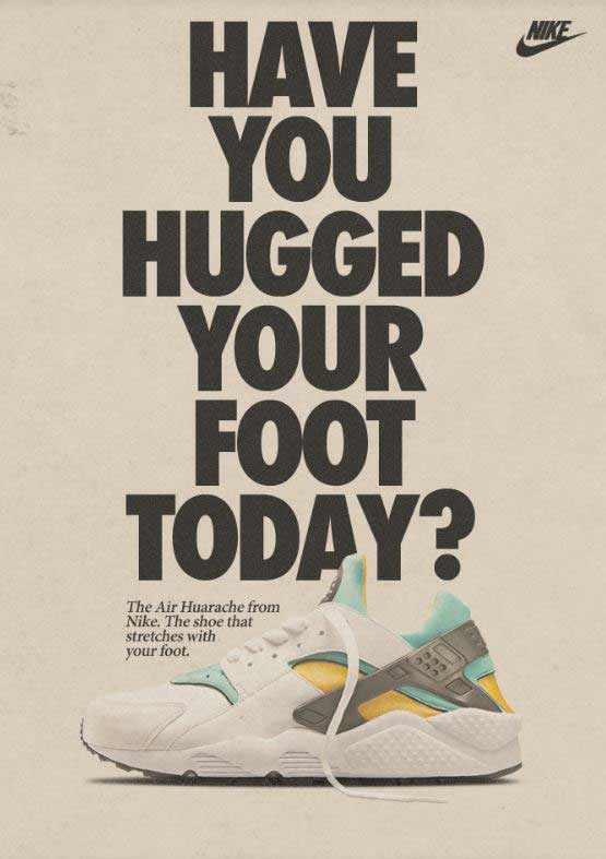
Air Huarache Nike shoe ad
https://medium.com/@korermex/nike-air-huarache-559967ee7471

This popular Nike ad first came to print in 1992, but was revamped when the shoes hit the market again, new and improved for 2013. The original design was done by the advertising agency Wieden+Kennedy, who are responsible for Nike’s “Just Do It” campaign. I found this ad on a website called Medium, posted back in 2015.

This post will examine the two typefaces in this advertisement. I will explain why each typeface belongs in a certain category, then I will explain how they contrast, but compliment each other.

Typeface 1 – Sans serif

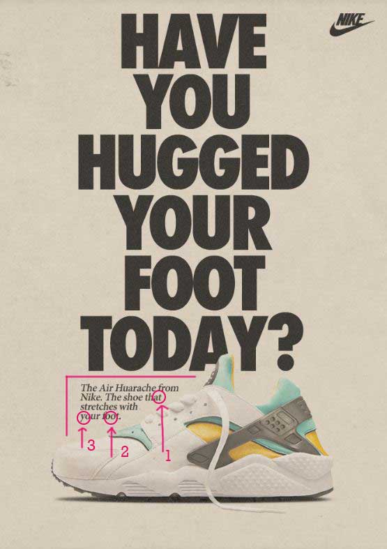
The first typeface is in the Sans serif category. This means that it does not have the tiny end stokes at the tops and bottoms of the letters as shown with the arrow pointing to number 1. Another way to distinguish that this typeface is in the Sans serif category is that the entire letter is the same thickness or monoweight. Sans serif typefaces have no thick/thin transitions in the strokes.

Typeface 2 – Oldstyle

The second typeface in this advertisement is considered to be in the Oldstyle category. We know this because Oldstyle has angled serifs at the top of the lowercase letters, such as the ones at the top of the t. The second indication that this is Oldstyle is the diagonal stress in the letter o. The third way to tell is the moderate thick/thin transition in the strokes, as shown in the letter y.

The Contrast

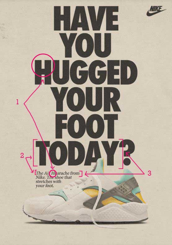
Now let’s take a look at how these typefaces contrast with each other. The first point of contrast has to do with the structure. The first typeface does not have serifs at the top or bottom of the letters. The second typeface does. One is monoweight, while the other has thick/thin transitions. These contrasting elements are complimentary to each other.

The size and weight of the typefaces also give great contrast. The Sans serif typeface is heavy and large, while the Oldstyle is a regular weight and very small. These differences add hierarchy to the page, first drawing your attention to the very large print, then moving your eye down the page to the smaller print underneath.

The form also contrasts between these two typefaces. The Sans serif typeface is all caps, while the Oldstyle is not. Also, the Oldstyle is italicized to give even more contrast. The contrast of form adds even more interest to the design.

Conclusion

Typography is an important part of design. It is essential to include contrasting, but not conflicting elements in your typography choices. Things to pay attention to are size, weight, structure, form, direction, and color. As you add these contrasting elements into your typography design, you can have advertisements that are still relevant over 20 years later, as Nike does with this ad.

Choose Print Ad Design Analysis

http://chooseprint.org/
Choose Print Advertisement
http://chooseprint.org/

This purpose of this post is to analyze the design principles used in the Choose Print advertisement above found on the chooseprint.org web page. This advertisement, featured in the November/ December 2017 issue of Graphic Design USA, details why print advertising is effective and environmentally advantageous for businesses. The design principles analyzed are contrast, repetition, alignment, proximity, and color.

Contrast

This advertisement uses contrast effectively in its use of typography. The block style print is contrasted with the script in the heading found at the top of the page. The size of the font also provides contrast. The font in the heading is large and the font at the bottom of the page is quite small. Contrast is also displayed in the choice of colors. The bottom-left corner is black with the top-right mostly white or light. This advertisement uses a nice balance of contrasting elements.

Repetition

The most evident use of repetition in this ad is the color green used throughout the design. The green color block on the top-left side of the page is displays the important information in the ad. Smaller pieces of the small green can be found on the woman’s shirt, the apple, and the company logo. These are found throughout the page, keeping the reader’s eye moving around the advertisement. Repetition can also be found in the word “PRINT” that is styled with the same font at the top and bottom of the copy.

Alignment

This advertisement uses two types of alignment. The headings and logos are styled with a center alignment, while the copy is styled to the left side. The two types of alignment work well together because of the placement of each style. The center alignment above and below the copy provides balance within the design.

Proximity

Effective use of proximity is used throughout this design. Each section of information is grouped appropriately with the use of font style, font size, and alignment. The sections are clearly defined with adequate space separating the groups of text. This makes the ad more organized and easier to read.

Color

The color scheme used in this design is an analogous color scheme. The colors aside from the image are shades of green and yellow, along with neutrals black and white. Green is often associated with nature, renewal, and the environment. Yellow is associated with energy, optimism, and enlightenment. Choose Print is a campaign promoting print advertising as an environmentally friendly source of advertisement, making these colors effective choices in alignment with the message that they are wanting to promote.

Conclusion

This advertisement uses the design principles of contrast, repetition, alignment, proximity, and color to effectively promote their message. Through the use of the design principles mentioned, the designer has made the advertisement eye-catching, easy to read, and memorable, all things that are important in advertising.