Contrast -Just Do It

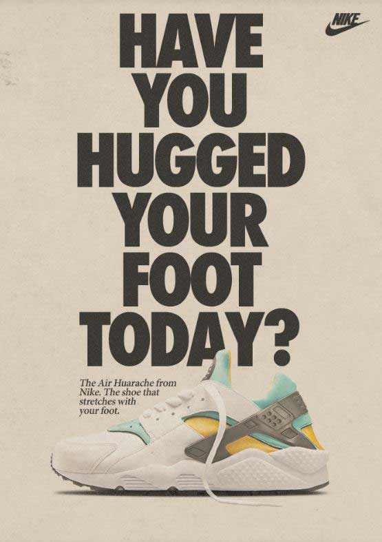
Nike Shoe Ad
Air Huarache Nike shoe ad
https://medium.com/@korermex/nike-air-huarache-559967ee7471

This popular Nike ad first came to print in 1992, but was revamped when the shoes hit the market again, new and improved for 2013. The original design was done by the advertising agency Wieden+Kennedy, who are responsible for Nike’s “Just Do It” campaign. I found this ad on a website called Medium, posted back in 2015.

This post will examine the two typefaces in this advertisement. I will explain why each typeface belongs in a certain category, then I will explain how they contrast, but compliment each other.

Typeface 1 – Sans serif

The first typeface is in the Sans serif category. This means that it does not have the tiny end stokes at the tops and bottoms of the letters as shown with the arrow pointing to number 1. Another way to distinguish that this typeface is in the Sans serif category is that the entire letter is the same thickness or monoweight. Sans serif typefaces have no thick/thin transitions in the strokes.

Typeface 2 – Oldstyle
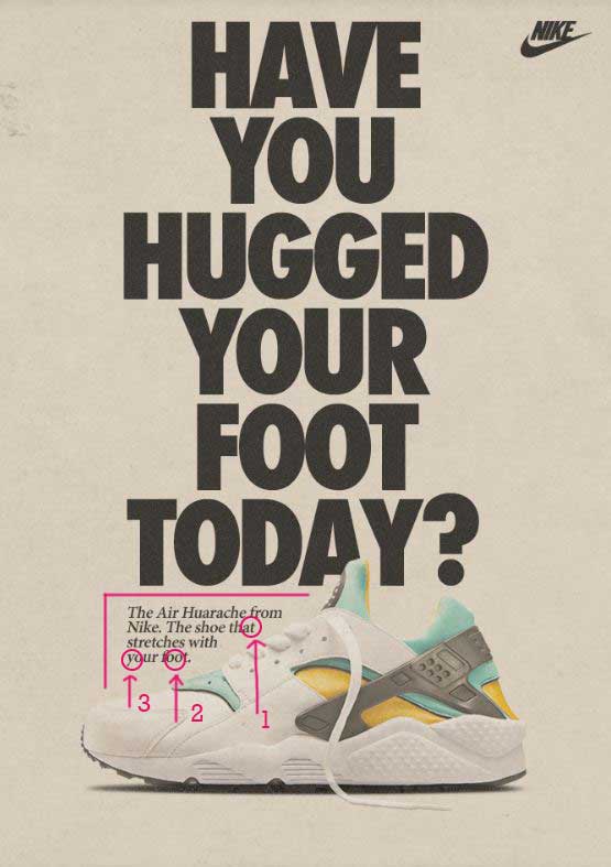
The second typeface in this advertisement is considered to be in the Oldstyle category. We know this because Oldstyle has angled serifs at the top of the lowercase letters, such as the ones at the top of the t. The second indication that this is Oldstyle is the diagonal stress in the letter o. The third way to tell is the moderate thick/thin transition in the strokes, as shown in the letter y.

The Contrast
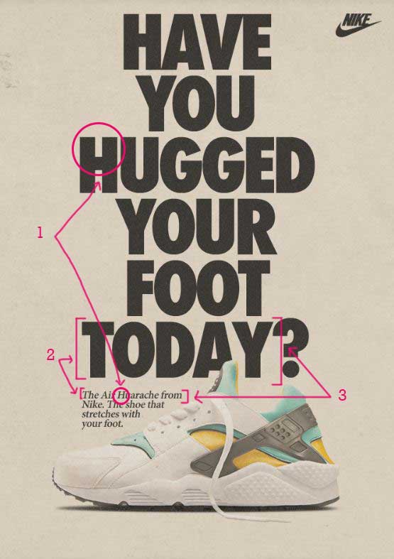
Now let’s take a look at how these typefaces contrast with each other. The first point of contrast has to do with the structure. The first typeface does not have serifs at the top or bottom of the letters. The second typeface does. One is monoweight, while the other has thick/thin transitions. These contrasting elements are complimentary to each other.

The size and weight of the typefaces also give great contrast. The Sans serif typeface is heavy and large, while the Oldstyle is a regular weight and very small. These differences add hierarchy to the page, first drawing your attention to the very large print, then moving your eye down the page to the smaller print underneath.

The form also contrasts between these two typefaces. The Sans serif typeface is all caps, while the Oldstyle is not. Also, the Oldstyle is italicized to give even more contrast. The contrast of form adds even more interest to the design.

Conclusion

Typography is an important part of design. It is essential to include contrasting, but not conflicting elements in your typography choices. Things to pay attention to are size, weight, structure, form, direction, and color. As you add these contrasting elements into your typography design, you can have advertisements that are still relevant over 20 years later, as Nike does with this ad.
Choose Print Ad Design Analysis

http://chooseprint.org/
Choose Print Advertisement
http://chooseprint.org/

This purpose of this post is to analyze the design principles used in the Choose Print advertisement above found on the chooseprint.org web page. This advertisement, featured in the November/ December 2017 issue of Graphic Design USA, details why print advertising is effective and environmentally advantageous for businesses. The design principles analyzed are contrast, repetition, alignment, proximity, and color.

Contrast

This advertisement uses contrast effectively in its use of typography. The block style print is contrasted with the script in the heading found at the top of the page. The size of the font also provides contrast. The font in the heading is large and the font at the bottom of the page is quite small. Contrast is also displayed in the choice of colors. The bottom-left corner is black with the top-right mostly white or light. This advertisement uses a nice balance of contrasting elements.

Repetition

The most evident use of repetition in this ad is the color green used throughout the design. The green color block on the top-left side of the page is displays the important information in the ad. Smaller pieces of the small green can be found on the woman’s shirt, the apple, and the company logo. These are found throughout the page, keeping the reader’s eye moving around the advertisement. Repetition can also be found in the word “PRINT” that is styled with the same font at the top and bottom of the copy.

Alignment

This advertisement uses two types of alignment. The headings and logos are styled with a center alignment, while the copy is styled to the left side. The two types of alignment work well together because of the placement of each style. The center alignment above and below the copy provides balance within the design.

Proximity

Effective use of proximity is used throughout this design. Each section of information is grouped appropriately with the use of font style, font size, and alignment. The sections are clearly defined with adequate space separating the groups of text. This makes the ad more organized and easier to read.

Color

The color scheme used in this design is an analogous color scheme. The colors aside from the image are shades of green and yellow, along with neutrals black and white. Green is often associated with nature, renewal, and the environment. Yellow is associated with energy, optimism, and enlightenment. Choose Print is a campaign promoting print advertising as an environmentally friendly source of advertisement, making these colors effective choices in alignment with the message that they are wanting to promote.

Conclusion

This advertisement uses the design principles of contrast, repetition, alignment, proximity, and color to effectively promote their message. Through the use of the design principles mentioned, the designer has made the advertisement eye-catching, easy to read, and memorable, all things that are important in advertising.