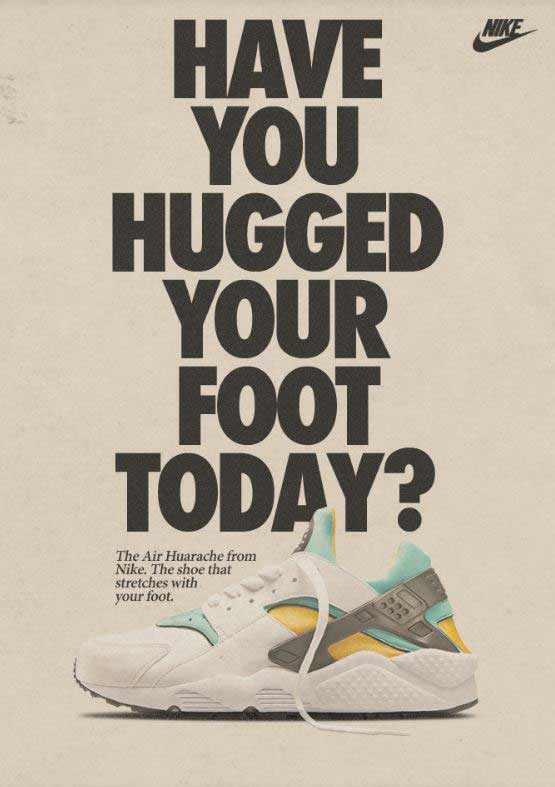

This popular Nike ad first came to print in 1992, but was revamped when the shoes hit the market again, new and improved for 2013. The original design was done by the advertising agency Wieden+Kennedy, who are responsible for Nike’s “Just Do It” campaign. I found this ad on a website called Medium, posted back in 2015.
This post will examine the two typefaces in this advertisement. I will explain why each typeface belongs in a certain category, then I will explain how they contrast, but compliment each other.
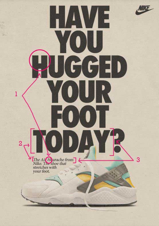
Typeface 1 – Sans serif

The first typeface is in the Sans serif category. This means that it does not have the tiny end stokes at the tops and bottoms of the letters as shown with the arrow pointing to number 1. Another way to distinguish that this typeface is in the Sans serif category is that the entire letter is the same thickness or monoweight. Sans serif typefaces have no thick/thin transitions in the strokes.
Typeface 2 – Oldstyle
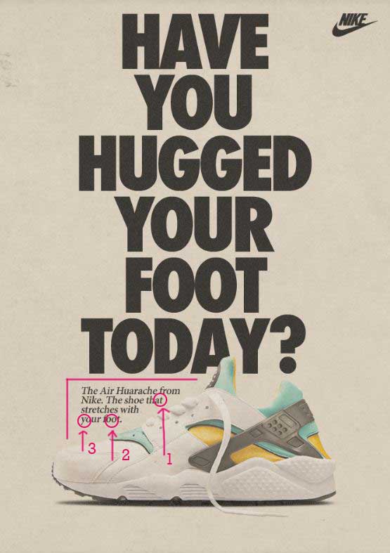
The second typeface in this advertisement is considered to be in the Oldstyle category. We know this because Oldstyle has angled serifs at the top of the lowercase letters, such as the ones at the top of the t. The second indication that this is Oldstyle is the diagonal stress in the letter o. The third way to tell is the moderate thick/thin transition in the strokes, as shown in the letter y.
The Contrast
Now let’s take a look at how these typefaces contrast with each other. The first point of contrast has to do with the structure. The first typeface does not have serifs at the top or bottom of the letters. The second typeface does. One is monoweight, while the other has thick/thin transitions. These contrasting elements are complimentary to each other.
The size and weight of the typefaces also give great contrast. The Sans serif typeface is heavy and large, while the Oldstyle is a regular weight and very small. These differences add hierarchy to the page, first drawing your attention to the very large print, then moving your eye down the page to the smaller print underneath.
The form also contrasts between these two typefaces. The Sans serif typeface is all caps, while the Oldstyle is not. Also, the Oldstyle is italicized to give even more contrast. The contrast of form adds even more interest to the design.
Conclusion
Typography is an important part of design. It is essential to include contrasting, but not conflicting elements in your typography choices. Things to pay attention to are size, weight, structure, form, direction, and color. As you add these contrasting elements into your typography design, you can have advertisements that are still relevant over 20 years later, as Nike does with this ad.
